Responsive web design
Websites that fit every screen.
A site that only looks right on one screen loses customers on the others. I build and repair responsive layouts that feel natural on phones, tablets and desktops, with the same care at every size.
Every project is quoted to fit. Message me for pricing.
What you get
- 01
Mobile-first layouts
The small-screen experience is designed first, then enhanced for larger screens, not squeezed down at the end.
- 02
Fixes for sites that break on mobile
Overflowing text, tiny buttons, hidden menus and broken columns repaired on a site that's already live.
- 03
Fluid type and spacing
Text and spacing that scale smoothly between sizes, so there are no awkward jumps at certain widths.
- 04
Touch-friendly interactions
Buttons and links sized for fingers, with menus and forms that are comfortable to use on a phone.
- 05
Images sized for each screen
The right image size delivered to each device, so phones don't download desktop-sized files.
- 06
Accessible by default
Readable contrast, visible focus states and a logical structure, so the site works for everyone who visits it.
How I approach responsive design
Look at how people actually use the site
We start with the pages that matter most and the devices your visitors use, then decide where the layout needs to change.
Build flexible layouts, not fixed ones
Layouts that adapt to the space available, so they keep working on screen sizes nobody planned for.
Check across a range of screen sizes
Every page is reviewed from small phones to wide desktops, and fixed wherever something feels off.
Is this right for you?
These are the situations where I'm usually the right person to call.
- Your site looks fine on a laptop, but text, buttons or menus break on phones.
- You're planning a redesign and want it done mobile-first from the start.
- Visitors leave quickly on mobile and you suspect the layout is the reason.
- A page, form or menu works on desktop but not on tablets.
If your situation isn't listed, message me on WhatsApp and we'll work out together whether I'm the right fit.
What to send for a quote
To get a quick, accurate quote on WhatsApp, send me:
- The address of the website that needs fixing.
- Which pages or devices look wrong.
- Screenshots of the problems, if you can.
- Whether the site is built on WordPress, React or something else.
Send it on WhatsApp (opens in a new tab), or email it to me.
Tools I use
- HTML5
- CSS3
- SCSS
- Tailwind CSS
- Bootstrap
- JavaScript
- React
- WordPress
Related work

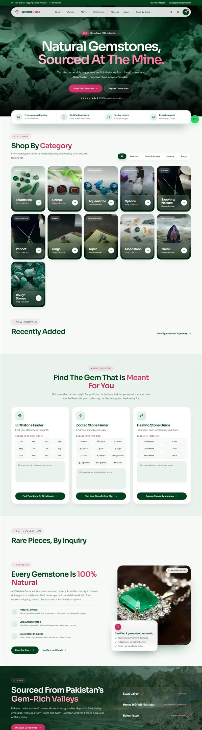
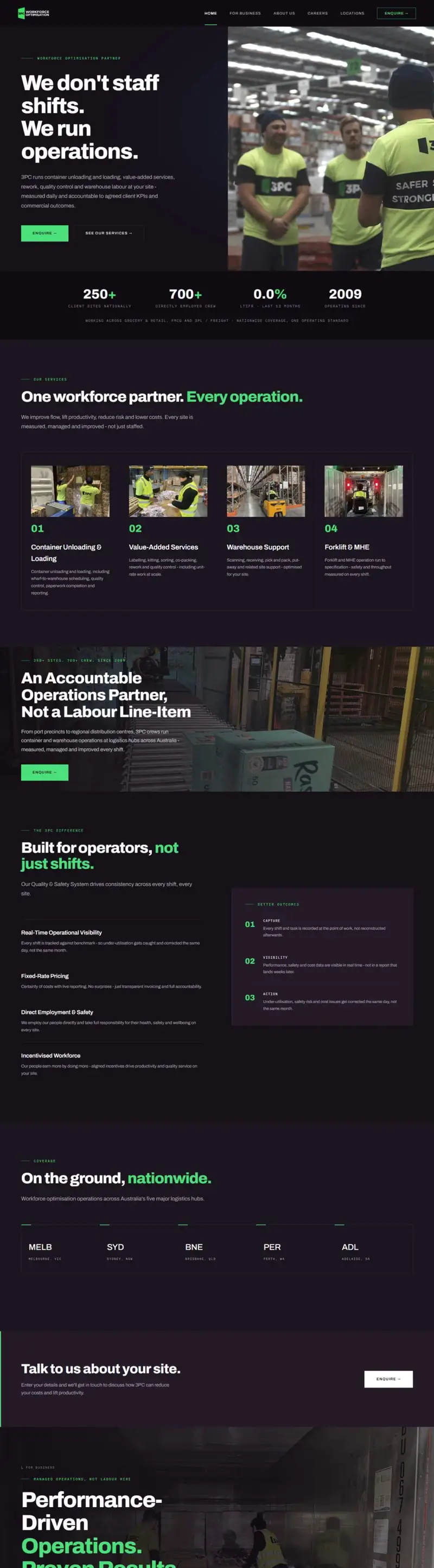
Common questions
My website looks broken on mobile. Can you fix it?
Yes. This is one of the most common jobs I take on. I find what's breaking the layout, fix it and check the result across different screen sizes, usually without rebuilding the site.
Does responsive design help my Google ranking?
Google primarily uses the mobile version of a page for indexing, and a site that is awkward on phones tends to lose visitors quickly. A good mobile experience helps both rankings and conversions.
How much does it cost to make my website responsive?
It depends on how many pages and templates are affected. Send me the link on WhatsApp and I'll take a look and quote the work.
Read more
Ready to talk about your project?
Message me on WhatsApp with a few details and I'll send you a quote. Prefer email? That works too.